Device & Accessories Catalogue Redesign
The product catalogues were in need of an overhaul. Customer confusion and support tickets were on the rise and our filtering experience was in a poor state.
Client: Telus (in-house)
Role: Design Lead
Date: Q2 & Q3 2023
OVERVIEW

The Problem
Our device catalogue was seeing a considerable drop in clickthrough, fewer and fewer customers were making it through to our configure experience and we were seeing an uptick in call centre tickets regarding confusion on discounts and promotions. This redesign would power the phone, tablet, smartwatch and accessory catalogues.
As the design lead for the Mobility team I led the redesign initiative, facilitated jams and critiques with our team and stakeholders, worked closely with the design team to provide guidance and feedback, and provided strategic direction driven by our research.

UNDERSTANDING

Why Are We Doing This Though?
1. A functional top-of-funnel.
The catalogue serves as one of the highest trafficked entry points into our sales funnel. by ensuring we have a strong experience we can get more qualified traffic through to the rest of the experience.
2. Maintaining our digital adoption.
If the homepage is the front door, then the catalogue is the wall of devices. We needed to continually find ways to replace the sales rep with customer led experiences.
3. Customer confidence
By building an experience that shows customers everything they need to know in clear, simple terms we support them through their journey with less distractions, questions, or confusion which can all lead to fallout. Especially when a competitor is just a click away.
Our Competitive analysis

The Diagnosis: What Needs Fixing?
As early as 2020, we just one year into the lifecycle of that iteration of the product catalogue, we began identifying pain points and quality-of-life optimizations to be made. Additionally we conducted a competitive analysis across a. range of brands to identify best-in-class experiences for merchandising phones and accessories.
Here's what we found:
○ Filters! Our filtering system was wildly out-of-date, lacked key options, and used a confusing interaction method that all but required some initial trial and error.
○ Promotion clarity. Both discounts and gift-with-purchase promotions lacked sufficienty details to reassure the customer on what and how they would be getting something.
○ Content hierarchy. The information we were presenting on our products flowed in an unintuitive way that could lead to more questions.

OUR HYPOTHESIS

Empower the Customer
Improved filtering will help customers find what they need faster. Clearer language and visual hierarchy of the product cards will give customers the confidence they need to make their purchase.

The Approach
With our competitive analysis completed we got to work on our priority list of enhancements which included
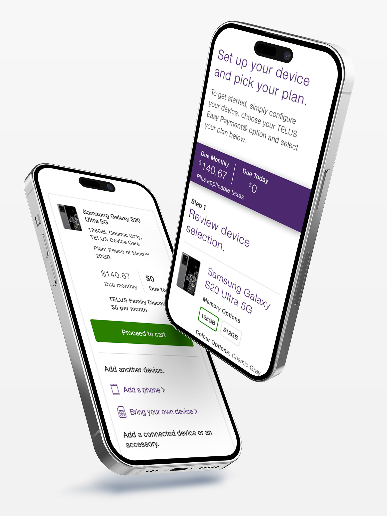
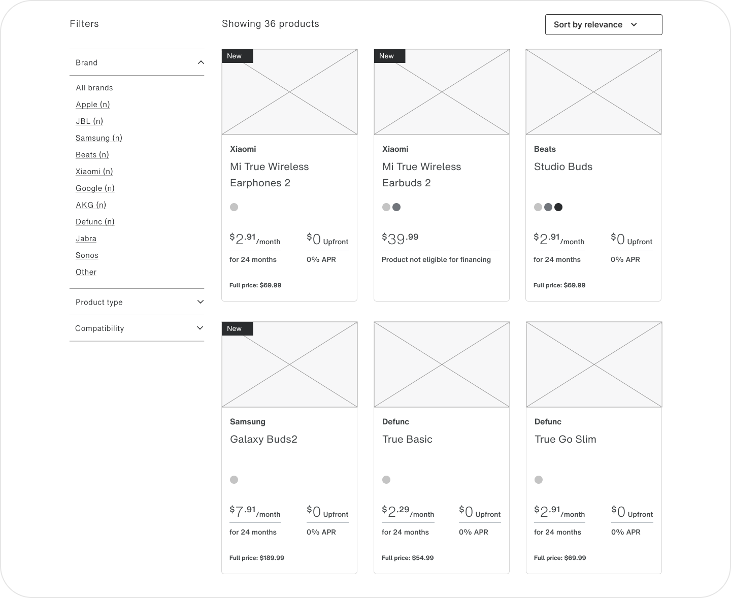
1. A fresh set of filters with more robust UX
2. Aligning the desktop view to a 2 column approach with filters taking the left most ¼ column of the screen and the devices taking the right most ¾
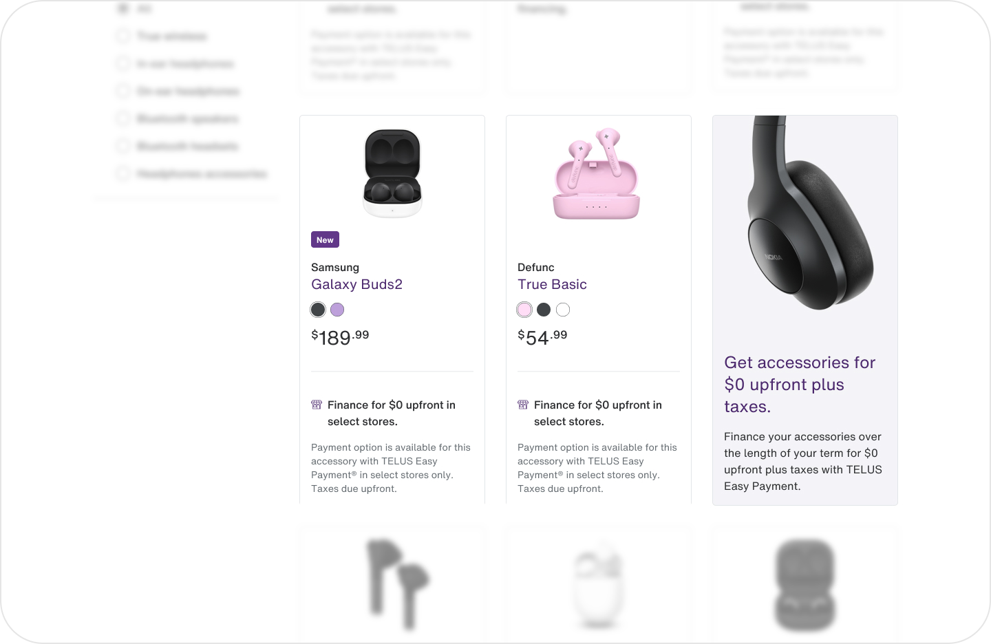
3. Iconography to delineate a price reduction vs a gift-with-purchase. Previously it was one generic “offer” icon
4. Revising content hierarchy and incorporating addition product details like colour options, lowest monthly price, and full device price
With our first pass of the wires completed we began user testing our prototypes with the help of our amazing User Researcher, Jaime. We leaned on card sorting to help build out the hierarchy and categorization of our filters, while we used unmoderated testing with tasks for our subjects like “Find the cheapest phone available” or “Find a phone with headphones as a gift with purchase”. This helped us ensure our features and messaging were clearly understood.
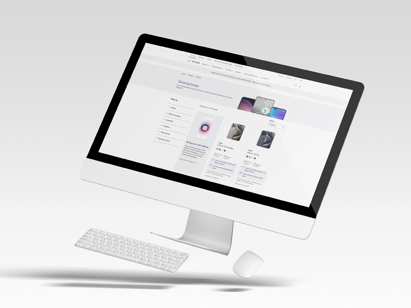
The Catalogue Design
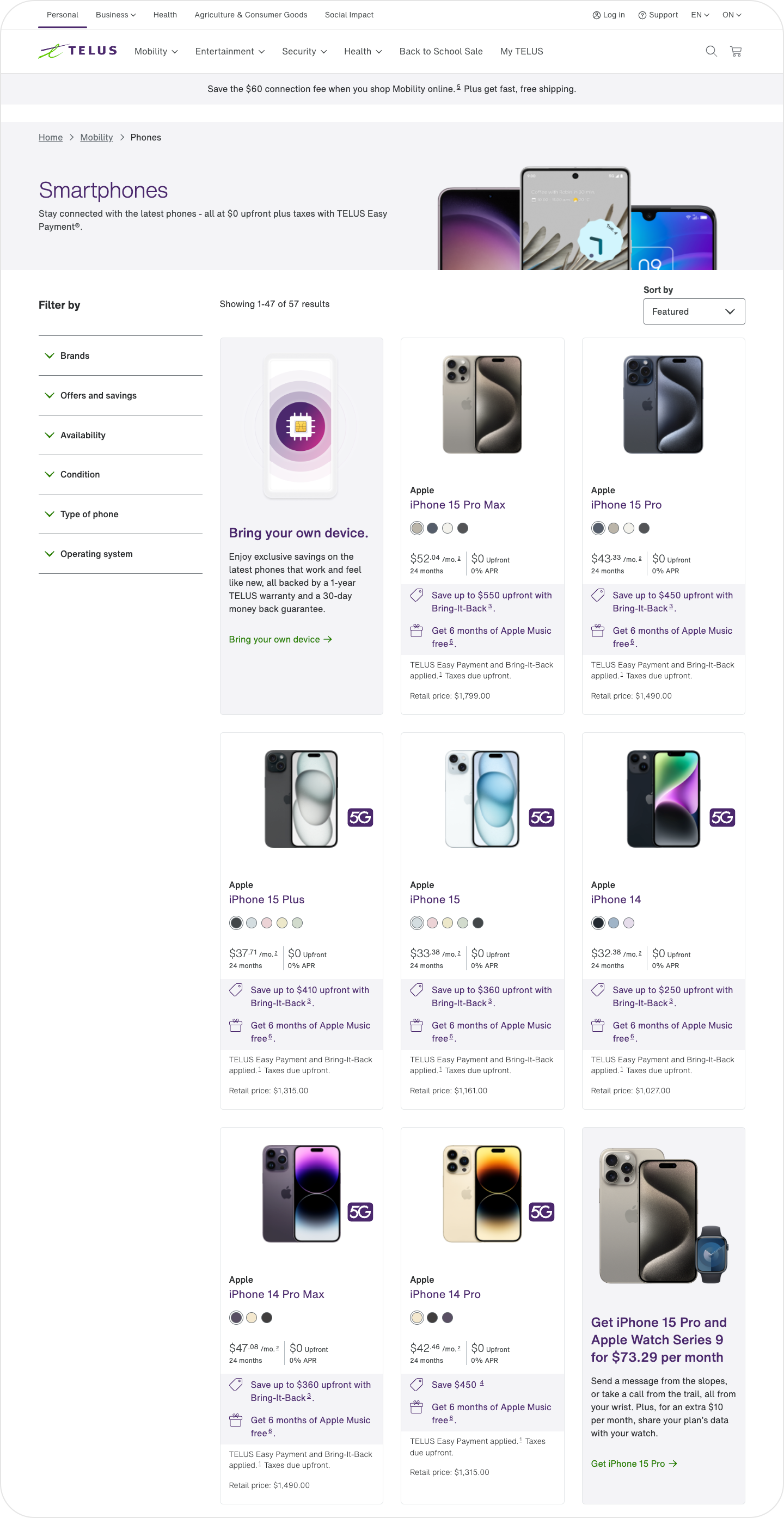
With a focus on clarity and a stronger hierarchy of information we were able to refine the amount of information presented within the product cards and make it more scannable and digestible for customers. We also incorporated on-page colour swapping of devices giving customers a better shop experience right from the catalogue page.
The Promo Card Design
An element I'm particularly proud of is the newly implemented promo card within the array of products. This was conceptualized and introduced by me and allowed us to further merchandise within the catalogue space by highlighting specific products, promotions or services. For example, if someone is shopping for headphones, we can highlight a promotion about receiving a free pair of headphones with the purchase of a particular brand of phone. This predicts behavior as phones and headphones are a common bundled purchase and it creates a more seamless and intuitive sales experience for our customers.
THE RESULTS

Driving More Traffic to the Buy-Flow
8%
Increase in traffic to product details page from users selecting a device on catalogue
14%
Decrease in customer service tickets regarding promotions, discounts and gift-with-purchase offers
7%
Increase in users reaching our configure experience from the product details page after clicking on a device from catalogue

NEXT STEPS

Always Iterating and Learning
The catalogue is a page which is never truly finished. As the product landscape continues to evolve there are always opportunities to add new filters, refine our cards and hone in on what’s truly working for our customers. Thankfully Telus has an extremely robust testing infrastructure (particularly when it comes to A/B testing). So this allows us to continually and nimbly refine the experience and try out new things.
Lessons Learned

Retrospective
This was a large in scope but small in artifacts project that taught me a lot. It’s easy to envision what makes a good product catalogue for myself, but to consider the widest target audience possible and ensure we’re communication the right information at the right time with appropriate clarity took a lot of fine tuning. Teamwork makes the dreamwork, so thank you to my awesome team, Jamie, Lynne, Zafeer, Vikas, Fenil, Jessica, Jaime (not a typo, a different person than Jamie), Rajavi, and Matt.
Be Smart About How You Test
Different information is informed by different testing methodologies. Instead of one big prototype to run through and hoping you get all your questions answered, approaching things with smaller scale, more tactical testing (ie card sorting our filters) helped us supercharge our efficiency, output, and work quality.
Shake It Up
Just because something has legacy isn’t a reason to keep it going. Sometimes you need to rip it up and start fresh. Being able to approach a project without any preconceived notions or ego and being willing to discard your old work in service of the project outcomes is so important.