Refining the Mobility Shopping Experience for Improved Conversion
The Device & Plan configuration experience was in need of enhancements due to considerable dips in our metrics as we approached the anniversary of a major redesign initiative.
Client: Telus (in-house)
Role: Senior Product Designer
Date: Q1 through Q3 2020
OVERVIEW

The Problem
9 months after launching our redesigned Device & Plan configuration experience we were seeing a consistent drop in scroll reach, cart starts and cart finishes, leading to diminished sales in our digital channels, while in-store sales remained consistent. Additionally, due to legacy systems constraints we could only process one device per order, leading to a frustrating experience for customers. As the senior product designer on the project I led the charge to revitalize our experience and improve our results.

UNDERSTANDING

Why Are We Doing This Though?
1. Invest in our less-than-one year old configuration experience.
Having dynamically shifted the telco landscape we needed to evolve and maintain that new experience to continue meeting customer expectation.
2. Continue to drive digital adoption to Telus as a brand.
Increasingly, users want seamless, comfortable online experiences and Telus needed to live up to their "Let's Make The Future is Friendly" mantra
3. Building trust amongst customers.
Telus consistently rates the highest amongst the major telcos for customer satisfaction, something that isn't taken lightly internally. Building for the customer and cultivating that trust is a foundational part of every project.
INTERPRETING THE DATA

The Diagnosis: What Does the Data Say?
Leveraging our deep well of analytics the data told a story that validated our assumptions. Our digital experience is leading to customer confusion and abandonment. The following are the biggest pain points we identified through customer feedback, click-through rates, scroll reach, and heat maps.
○ 60% of users were leaving the configuration experience without clicking on anything
○ A lack of clarity on the length of the flow or what the process entails
○ Frustration on having to make separate purchases for multiple devices. Some even said they would stop shopping online and go in-store instead (oof!)
○ Heat maps and click tracking showed us users were trying to engage with static instructional copy on the left side of the page
○ Existing customers were completely missing the log-in callout as it was an optional step. In a few extreme cases existing customers placed an order as a new customer, thereby creating an entirely new account
THE OLD EXPERIENCE

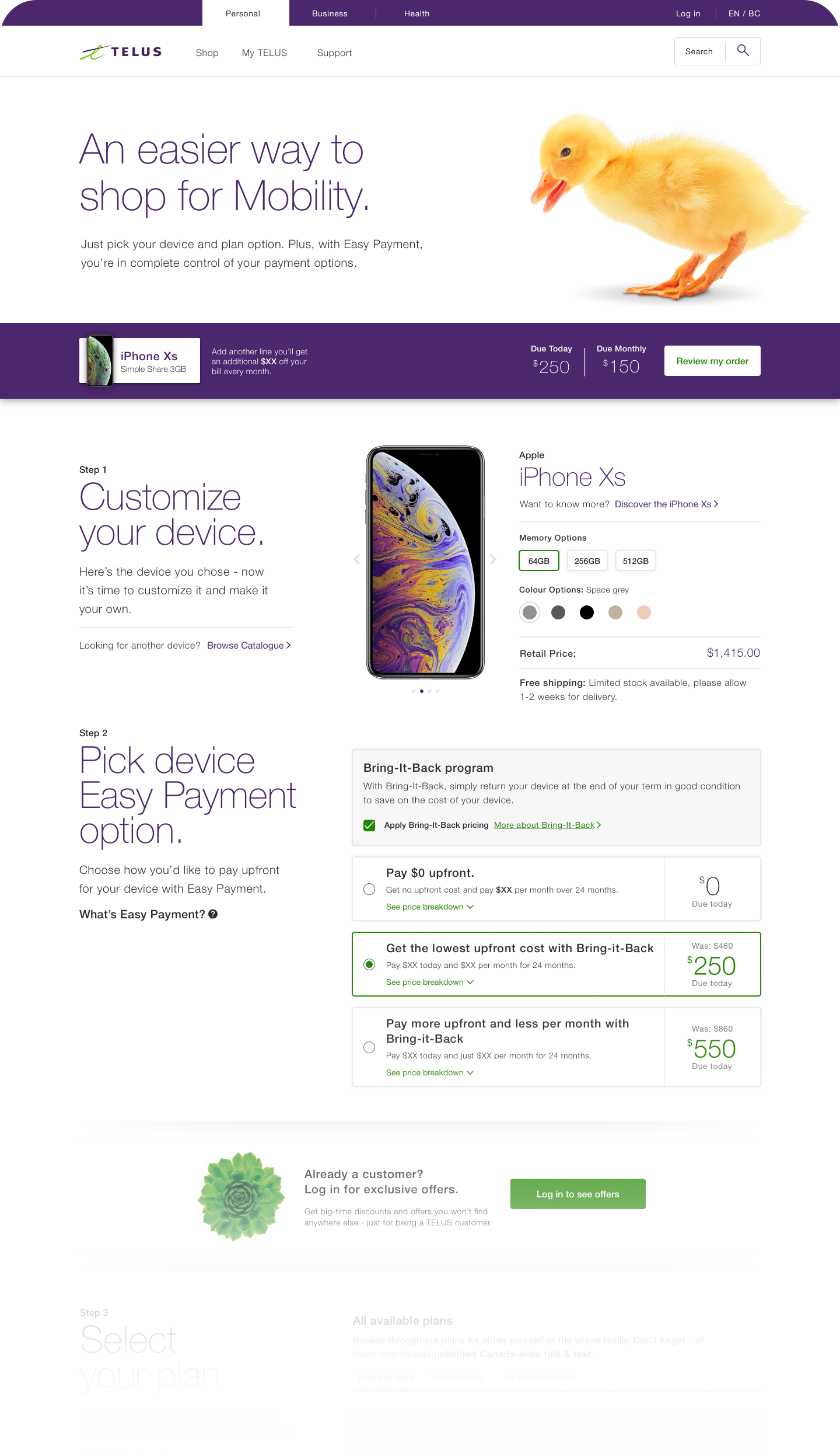
The Approach
Thanks to the gathered feedback and data we had a clear path forward and turned those insights into action items.
1
First Impressions
Reduce the size of the initial content blocks to get users into the key content quicker. With a crowded and seemingly unrelated top section of the page users were unsure if they'd even landed in the right place.
2
Improved Content Hierarchy
Restructure the content to have key interactive elements centred to visually funnel users down the page and de-emphasize the step titles. Our educational content was becoming a distraction, so it's time to streamline.
3
Mandatory Steps, Especially Login
Redesign the log-in experience and make it a halting step. The user must directly declare themselves as either a new or existing customer. By making a user address every step one at a time we give them a constant and clear next action which better manages frustration and fallout from a lack of guidance. No more getting lost or missing key actions.
4
Wayfinding and clarity
Include a list of collapsed steps with clear, easily understood titles. Users want to know what they're in for, and while some products or choices can branch or reveal new steps we can at the very least assume the baseline experience a user will go through.
OUR HYPOTHESIS

Radical Simplification
By making a more focused and simplified experience we'll more effectively move customers through to checkout with less friction

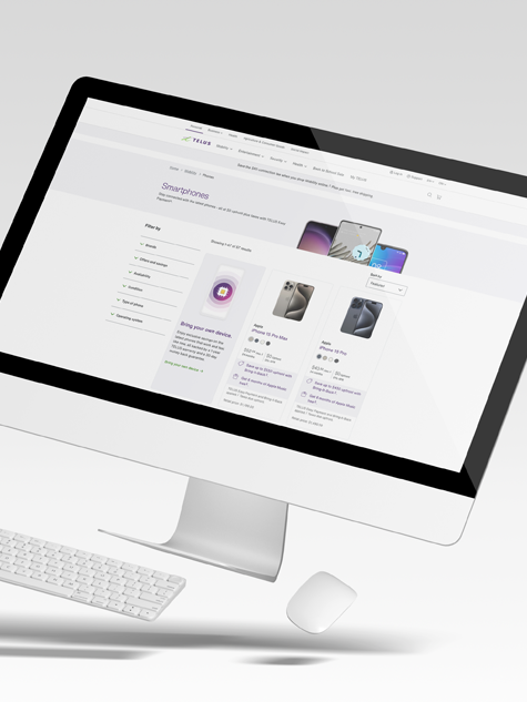
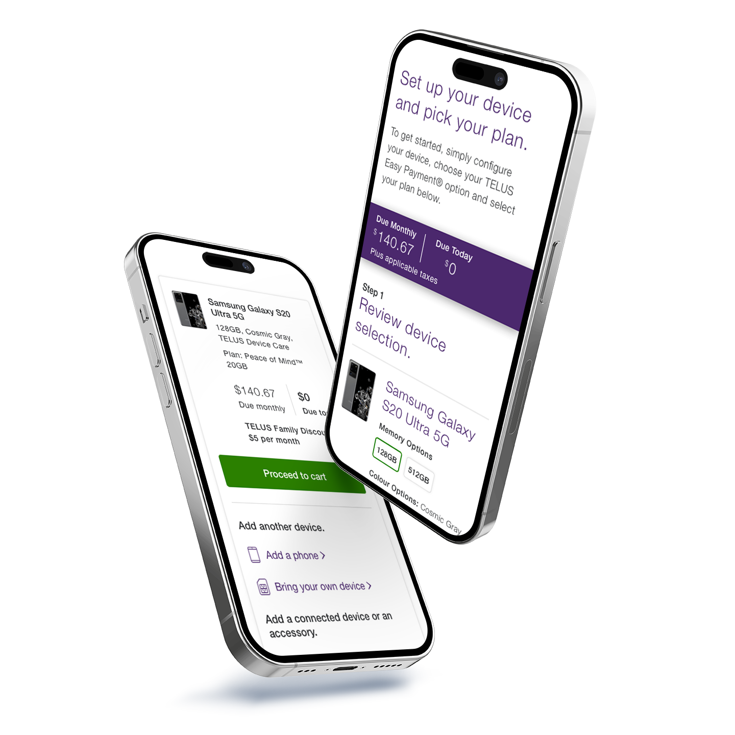
THE EXPERIENCE

The Guided Flow
Taking into consideration all our user data and feedback, we radically streamlined the experience, reduced clutter and focused all the content and key elements into the centre of the screen. Funnelling the users eyes to the CTA situated at the bottom of every step, always showcasing their next immediate action.
THE RESULTS

A Smoother Flow and Positive Change
Upon completion of our "Guided Flow" design initiative in Q3 we saw lifts in our key metrics and engagement throughout the remainder of the year. Closing out 2020 with a 31% month-over-month increase in new activations.
While there was a slight increase in fallout (1.9%) earlier in the flow, we saw an overall increase of cart completion (5%) giving us more qualified traffic through the flow.

THE NEXT CHALLENGE

Multi-Unit Transactions
For the new multi-unit transaction feature, the initial ask from our stakeholders was simply to jump a user back to the top of the existing configure page to start the order of their next device. We felt this was potentially confusing and not ideal, so we took a different approach and started with a competitive analysis of some best-in-class eComm experiences.
We saw consistent themes right away.
1
Clear communication of progress and status
2
Restating of the order for customer clarity
3
Cross sell opportunities
4
Relevant navigation for ease of use, especially to go checkout immediately
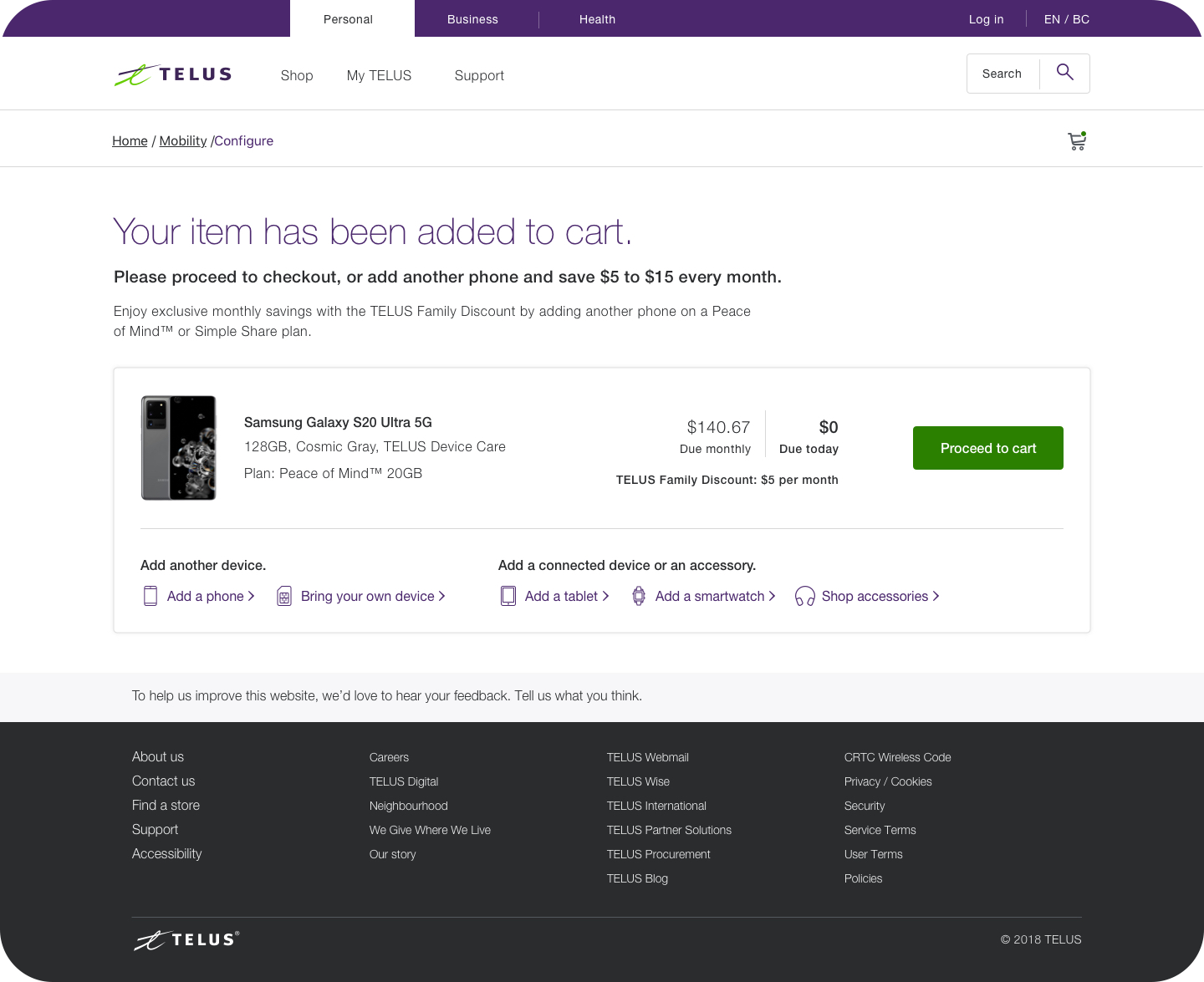
First Iteration of the Added-to-Cart Page
Those insights from our competitive analysis led us to a lean summary and linking hub to facilitate a customers shop journey and give them quick-linking to other products and a prominent checkout CTA
Multi-Unit Transaction Results

A Consistent Share of All Transactions
With the launch of the Added to Cart page and the bundled multi-unit transaction functionality, we've seen that transaction type take up a huge portion of all sales. Additionally The streamlined experience has shown immediate success in both our transaction types and volume
23%
Of all new account and add-a-line transactions are multiline (phone only)
22%
out of all new account and add-a-line watch purchases are Phone + Watch
30%
of all new account and add-a-line multiunit transactions are Bring Your Own Device
30%
out of all new account and add-a-line tablet purchases are Phone + Tablet
NEXT STEPS

A Forward Thinking Attitude
Taking a forward thinking attitude I identified an opportunity to develop a recommendation engine to cross-sell specific products. Since we know the product the user just ordered, we're able to nimbly provide recommendations on the latest accessories, like cases and earbuds, that align with the device and brand. Ordered the new Samsung Galaxy? Here's a compatible charger, Galaxy Buds and a case for your consideration.
Second Iteration of the Added-to-Cart Page: Accessory Recommendations
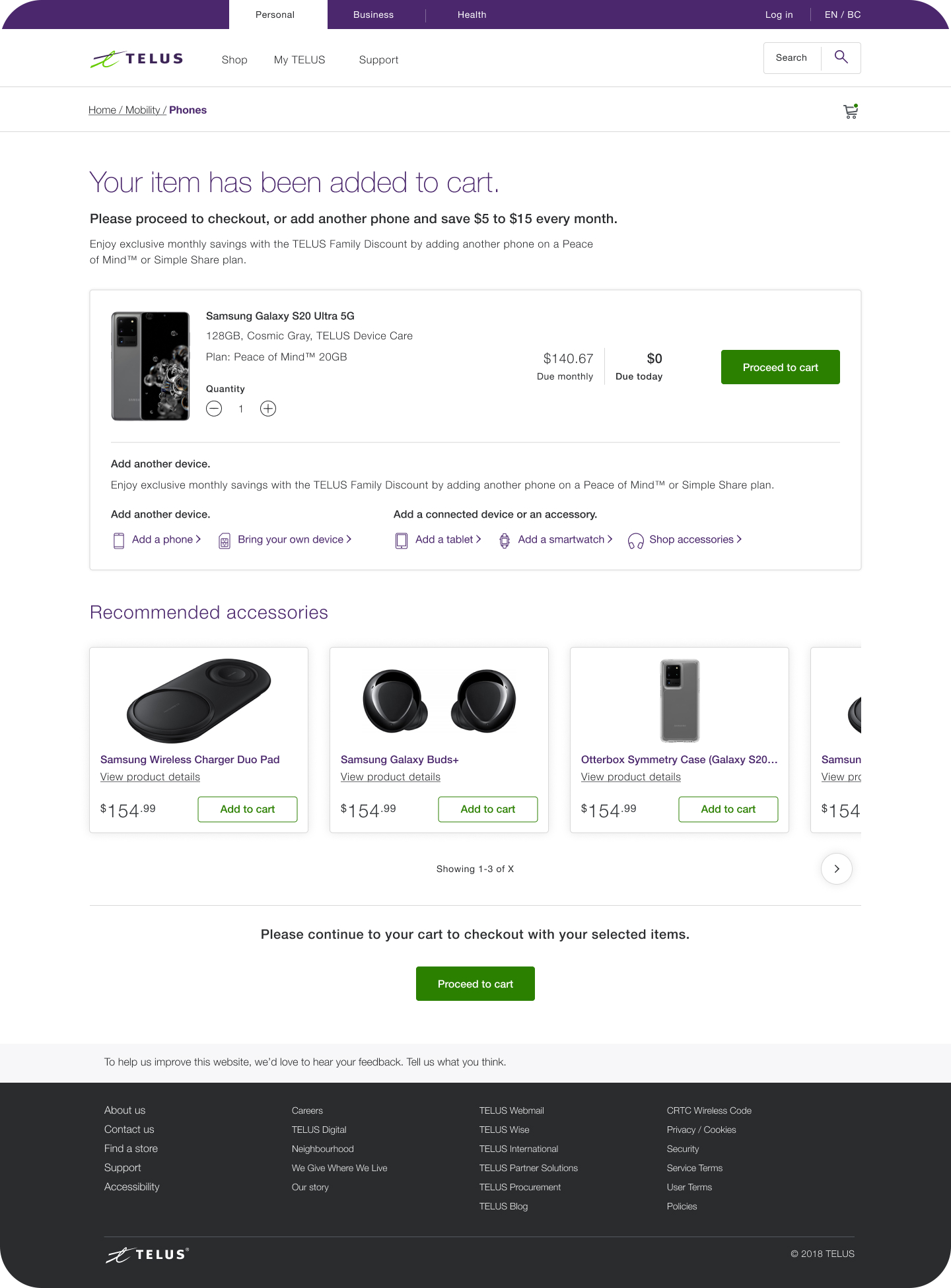
I'm proud to say that the final execution and the accessory recommendations were both above and beyond the original ask. Driven by design thinking and a customer-first approach. The accessory recommendation in particular was not on anyones radar, was not a part of the ask or original scope, and for that reason it was presented as a potential future state of the experience. It was quickly recognized as a much needed core part of the sales experience that would be incorporated when we could allocate a sprint for a wider design exploration and tech assessment. That work was eventually completed and it is currently live on the site.
Lessons Learned

Retrospective
This was a fascinating project and was the first time I had such a wealth of data right at kickoff, informing everything we were doing. It let me work in a new way and think about the problems in a way that really changed our strategy and approach. I’m so grateful to my amazing team, Jamie, Lynne, Zafeer, Vikas, Mawish, Ruchi, Matt, and Brian.
Keep it simple
In the initial redesign of this configure experience we over-indexed on explaining things heavily as it was (at the time of launch) a very new product framework in the telco landscape. Over time we saw how much that really bogged us down and we could’ve thread that needle better. Simplicity, both in terms of design and content goes a long, long way.
Be an owner, be a dreamer
The inclusion of the accessory recommendations is something I’m still extremely proud of. That feature serves as an example of the type of opportunity for enhancements beyond the scope of a brief that I showcase to designers. There is always room for design and content practitioners to build the experience they desire, to think about the potential and the opportunities before us, and truly own their portfolio.